Anastasia Koulourioti
this interview found me in:
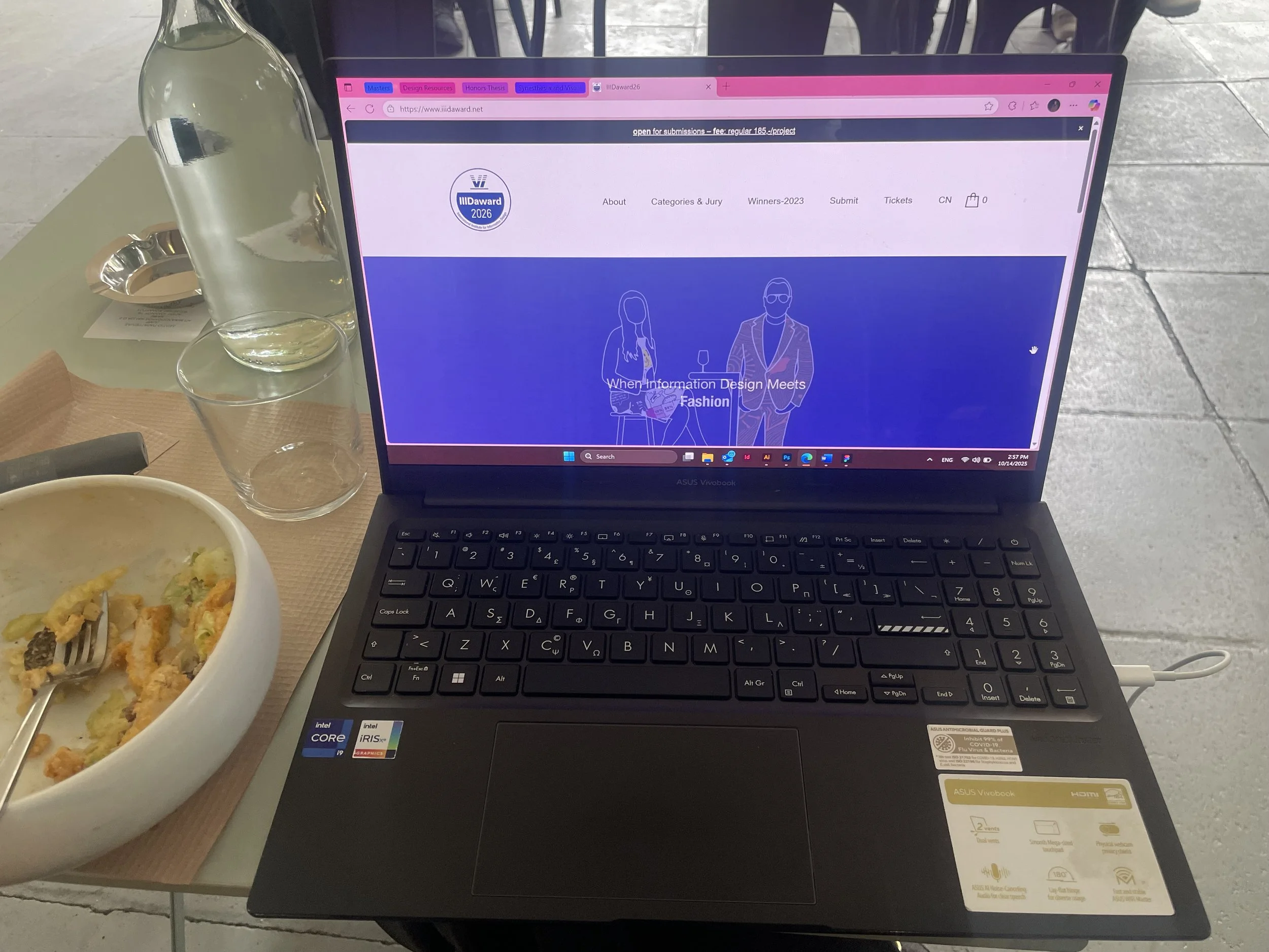
A cafe in Athens, doing some work...
the last time I got lost in …:
…a search for the perfect font. I started with one typeface and ended up hours later in an online archive with all type foundries, examining letterforms and getting ideas for a new project
my favourite pictogram/sign is:
The simple but effective “i” for information. It is universal, understated, and always inviting clarity.
three numbers about myself:
1 sketchbook always with me for ideas that can’t wait.
2 languages I design in.
3 fonts I use obsessively.
my preferred colour combination:
Dark blue and white. It feels structured, calm, and timeless, working both in analog and digital applications.
something I would like to show:
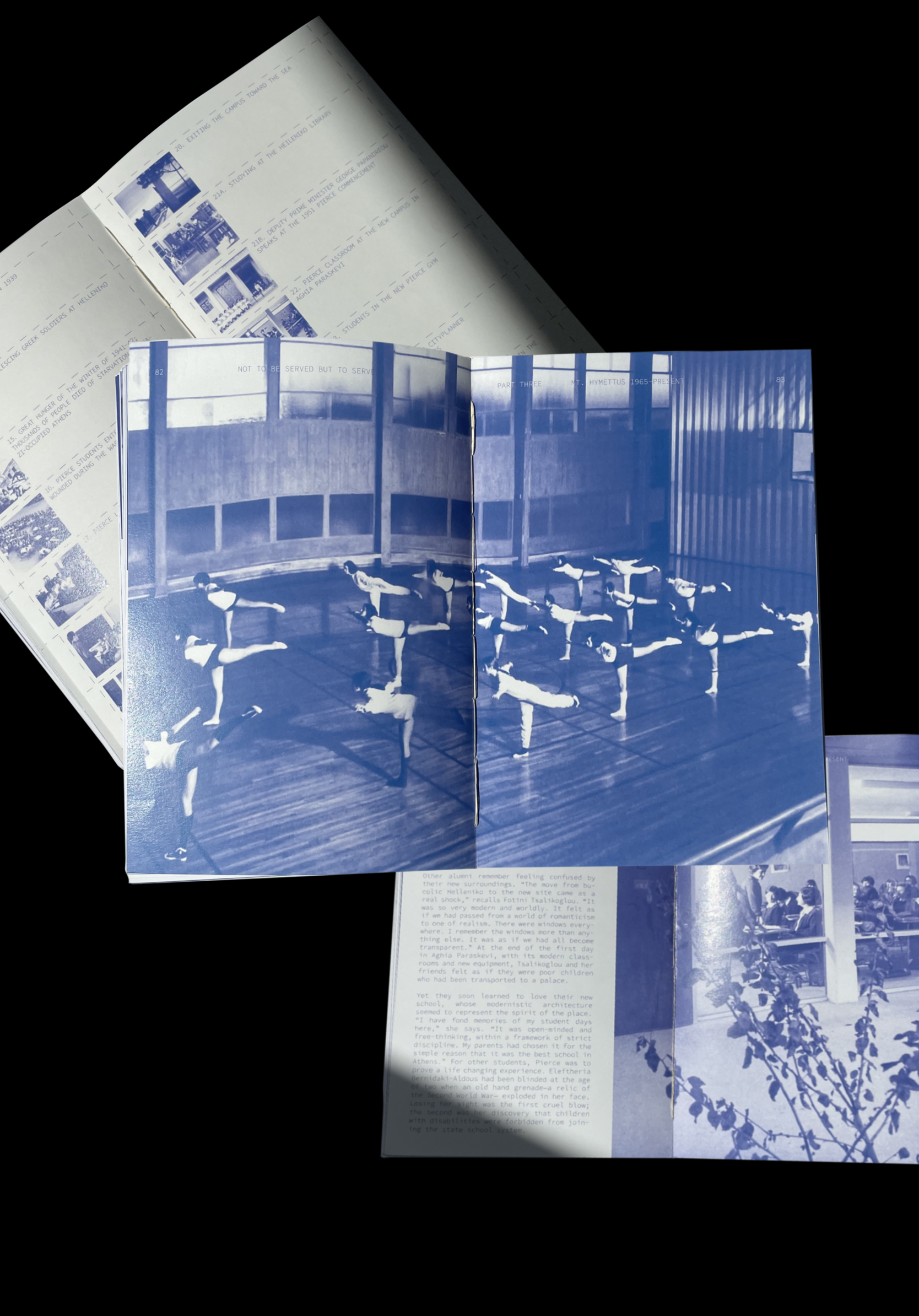
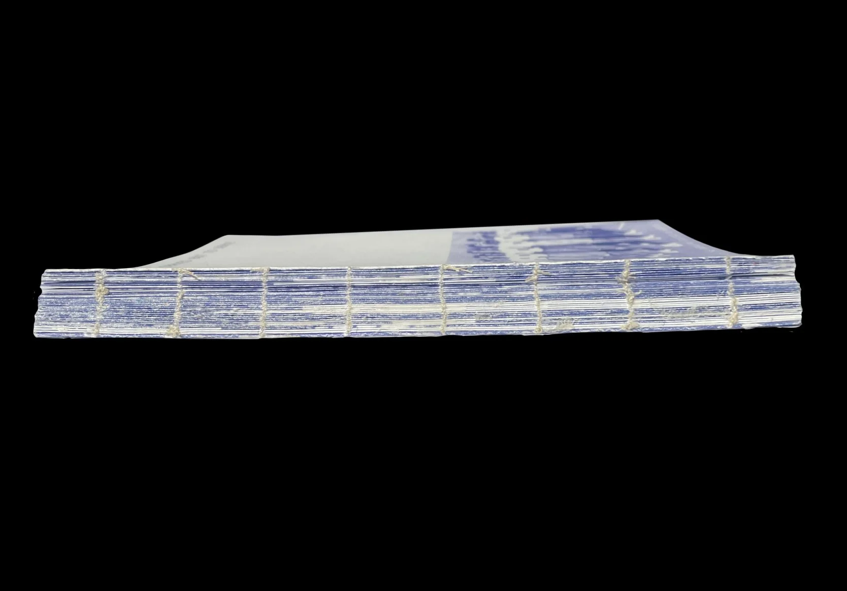
The book I designed for the history of my institution that got me 6 hours to bind and sew by hand!!
my mission in the jury:
To celebrate projects that not only inform but also engage, designs that transform data into understanding and clear communication. Recognize work where information design becomes a bridge between people and knowledge. While also, to evolve as a designer myself, belonging in a group with exceptional professionals, and sharing our excitement and passion for design.


